Release Information

  • Concept to Completion

    Concept to Completion

    Sunlight Through the Lattice

    “Sunlight Through the Lattice” has a dark lattice that frames diagonal stripes of yellow vines and soft earthy tones. The delicate botanical details give the design a cozy elegance that feels like looking out a window. 

    Behind the Scenes: The Initial Concept

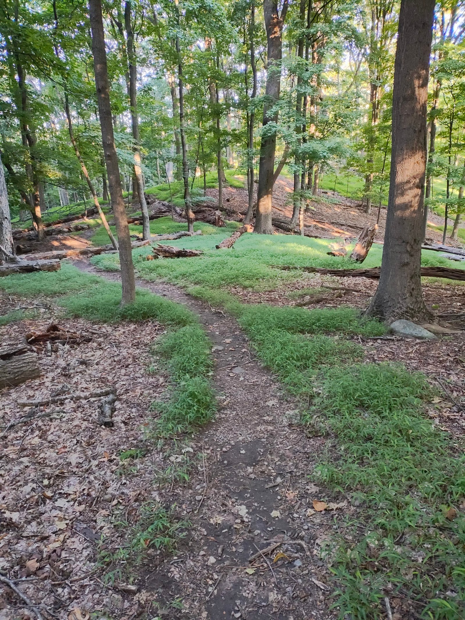
    I was inspired by the earthy colors  and botanicals seen during a dawn hike in the fall.

    Step 1 was to take watercolor paint in the earthy dawn hike colors and lay it down on a very wet canvas. Take a look at the piece before adding ink. 

    Step 2 was to add in ink flowers and vines to complement the colors and highlight areas of dark wash. 

    Thank you so much for being here and following along with my creative process!

  • The Blueprint of Brilliant Brainstorms

    The Blueprint of Brilliant Brainstorms

    Fall Hike Shots

    Inspiration comes from a vast array of places. Whether it is inspiration for an art piece, a musical composition or even a masterful excel spreadsheet, it is important to recognize when inspiration is sparked so you can more easily become inspired the next time you really need it. This ongoing series can help you learn how much inspiration is found around you at any time.

    In this addition of “The Blueprint of Brilliant Brainstorms,” I’m reflecting on the hikes and walks I’ve taken this fall. Hiking season goes until it snows. 🙂

  • The Blueprint of Brilliant Brainstorms

    The Blueprint of Brilliant Brainstorms

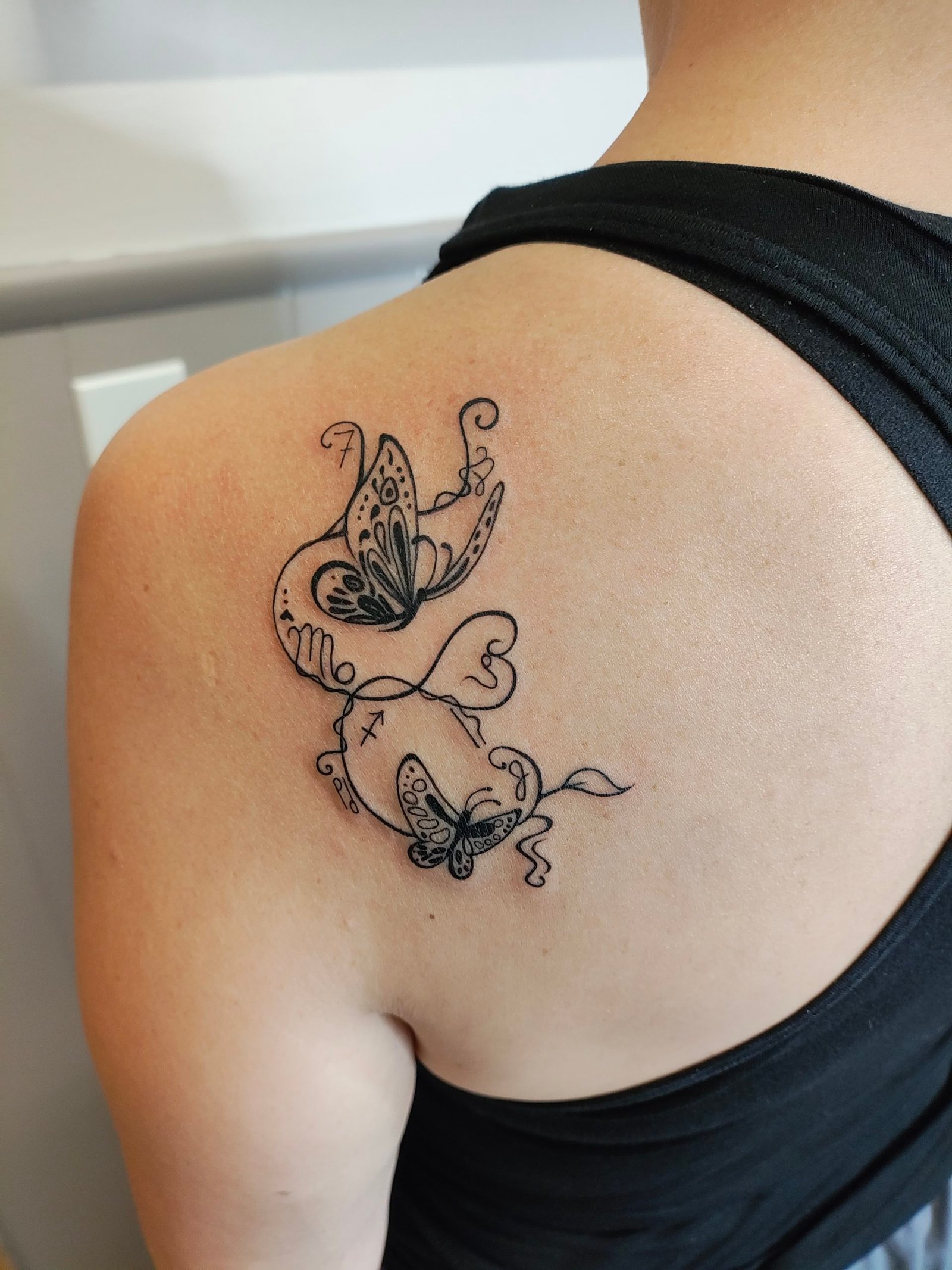
    Horoscopes – Sagittarius as inspiration

    Inspiration comes from a vast array of places. Whether it is inspiration for an art piece, a musical composition or even a masterful excel spreadsheet, it is important to recognize when inspiration is sparked so you can more easily become inspired the next time you really need it. This ongoing series can help you learn how much inspiration is found around you at any time.

    One of the major themes I explore across my artwork is fire. 

    My interest in fire, with the heat and dance of the flames, started in childhood as did my love of horoscopes. Born in early December, I am a Sagitarrius with my Rising sign in Leo. As a Sagittarius, I am part of the group of fire signs that also includes those born under the star signs of Aries and Leo. This definitely explains my early fascination with the flame.

    This fire comes through me in a myriad of ways. Sometimes the fire feels like anger as I splash the paint across the page. Sometimes it feels like passionate love as I build a delicate harmony of cascading colors. Take a look at the 3 art pieces I’m highlighting in today’s newsletter and see if you can feel the fire.

    Sometimes the art I create is for myself. A few years ago, I began creating a tattoo design that incorporated butterflies which have always been a reminder of those I have lost, as well as the signs of the most important, most influential people in my life thus far. Check out the design below after if was tattoo on me. 

  • Concept to Completion

    Concept to Completion

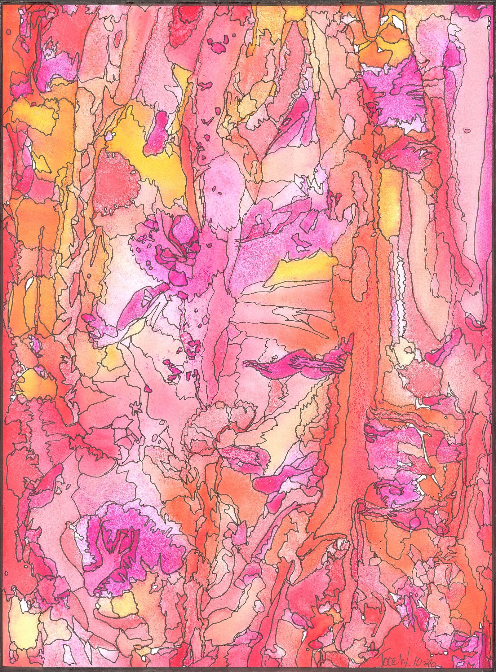
    Petals Crystalline in Autumn Sun

    The gorgeous changing colors of the leaves have caught my eye and inspired me to use the colors to create an abstract piece for this week. 

    Behind the Scenes: The Initial Concept

    I wanted to evoke the feeling that you are looking through sunlit autumn leaves. I wanted a dreamy feel to the piece. 

    Step 1 was to take watercolor paint in bright autumn colors and lay it down on a very wet canvas. Take a look at the piece as it dried. 

    Step 2 was to overlay with ink details, outlining the different colors and shapes the watercolor paint made as it dried.

    The final piece glows with gorgeous autumn warmth. The stained-glass-style outlines catching shades of peach, golden yellow, and magenta which create a textured mosaic of seasonal light.

    Thank you so much for being here and following along with my creative process!

    Paid Substack Subscribers get access to selection of device wallpaper!

  • Fiery Abstracts

    Fiery Abstracts

    To Match the Falling Leaves

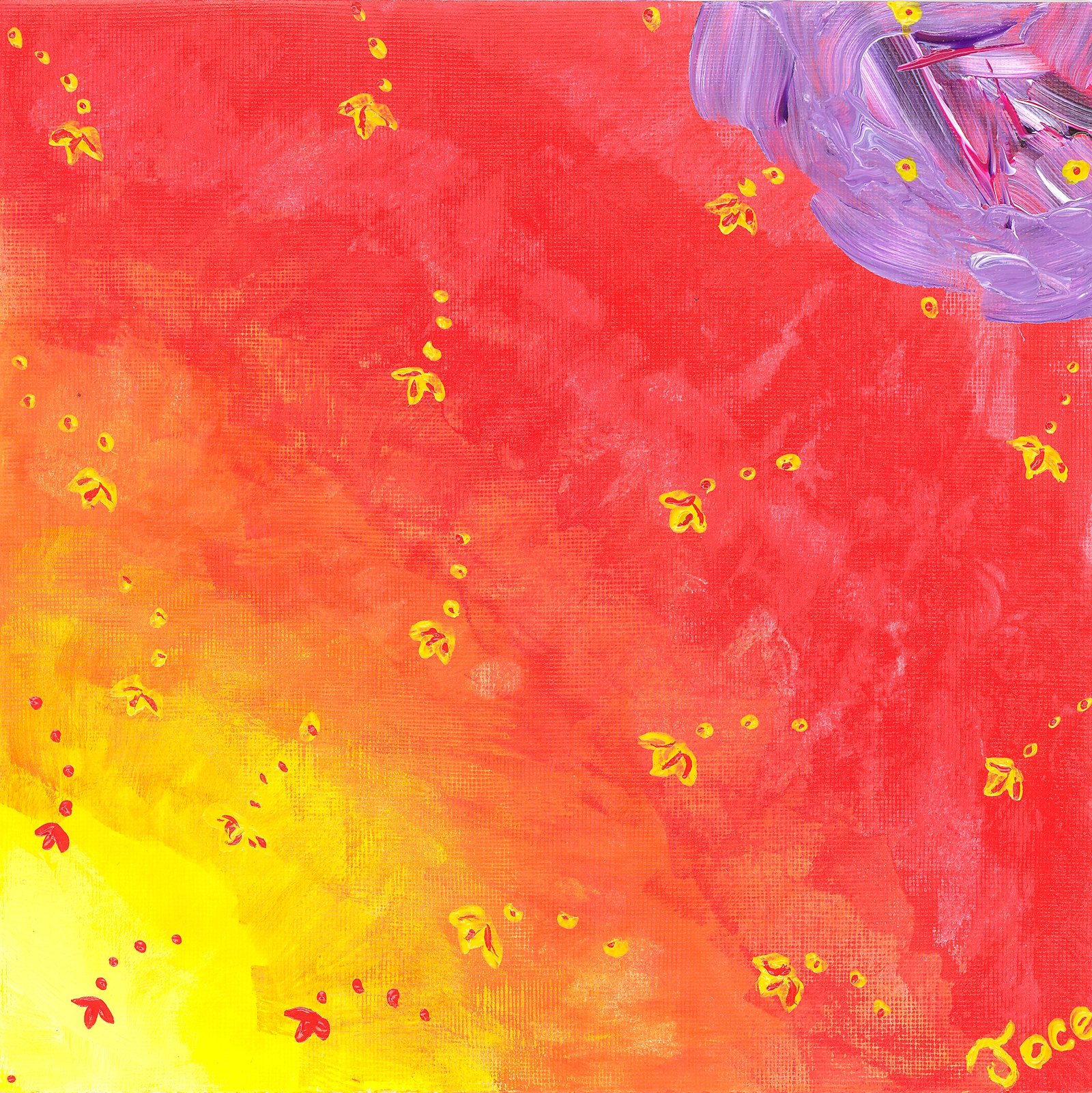
    “Flying Flowers of Fire”

    8/2025

    6” x 6” (framed copies 10” x 10”, 12” x 12”, 14” x 14”)

    Acrylic Painting on Heavy Paper

    “Flying Flowers of Fire” has a fiery energy. Yellow sparks dance across the canvas, while a textured purple in the corner adds a beautiful, rich contrast to the whole scene. The background glows from bright yellow to deep red, like a vibrant sunset.

    “Solar Ascension”

    1/2026

    12” x 9” (framed copies 18” x 12”)

    Acrylic Painting on Paper

    “Solar Ascension” gives off warmth and energy. The fiery orange and red plumes sweep upward against the glowing yellow backdrop. The dark lines and bold red curve at the top give the whole canvas a striking, flame-like movement.

    “Midnight Petals on a Summer Day”

    4/2026

    12” x 9” (framed copies 18” x 12”)

    Acrylic Painting on Paper

    In “Midnight Petals on a Summer Day” there is a contrast between the deep midnight-blue petals and the radiant background of yellows and fiery orange. The loose brushstrokes give the floral scene a sense of energy and movement.

    A little Haiku to end the post:

    Bright flames rise and dance,

    Soft sparks soar in golden skies,

    Petals take their chance.

  • Orange and Red Abstracts

    Orange and Red Abstracts

    Fiery Colors to Match the Fall Leaves

    “Narrative of the Vine”

    11/2025

    9” x 12” (framed copies 12” x 16”)

    Acrylic Painting on Paper

    With a whimsical, storytelling vibe, “Narrative of the Vine,” combines vibrant green vine loops across the warm background, connecting bright cherries, delicate flowers and leaves. The texture and flowing lines give the scene a sweet, organic feel.

    “Prosperity in Bloom”

    1/2026

    12” x 9” (framed copies 18” x 12”)

    Acrylic Painting on Paper

    In “Prosperity in Bloom,” the palm-like branches sprout stylized dollar bills in dark hues. Set against that vibrant red and pink background, it’s a striking, playful look at growth and prosperity.

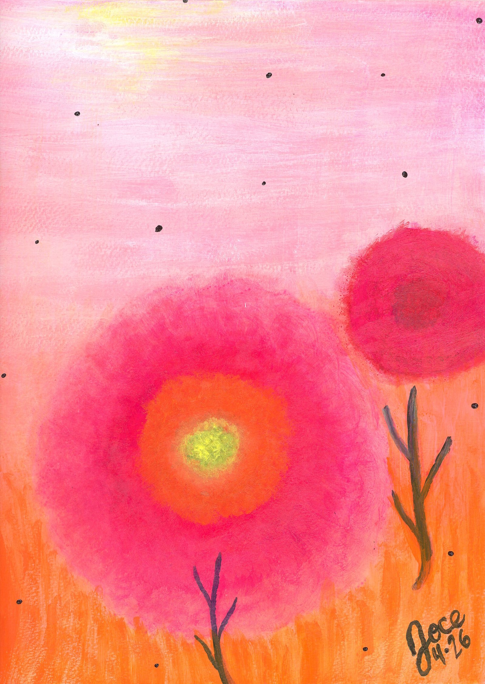
    “An Echo in the Garden”

    4/2026

    12” x 9” (framed copies 18” x 12”)

    Acrylic Painting on Paper

    With a dreamy, glowing warmth, “An Echo in the Garden,” portrays the soft, blended rings of bright pink, vibrant orange, and glowing yellow in these oversized round abstracted blooms. Against a hazy sunset with floating dark specks, the scene feels peaceful and dreamy.

    A little Haiku to conclude today’s post:

    Vines twist, branches bloom,

    Soft sunny skies hold quiet growth,

    Roots break through the gloom.

  • Graphic Doodles for Fall

    Graphic Doodles for Fall

    Focusing on Yellow, Orange and Green Combined On the Canvas

    “Sun-Kissed Patchwork”

    6/2025

    8.25” x 5.75” (unframed copies 7” x 5” or 10” x 8”; framed copies 12” x 18”)

    Marker Drawing on Paper

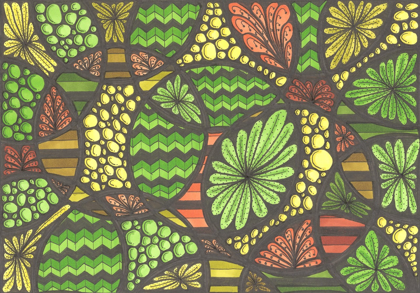
    Like a sunny, happy quilt, the diagonal panels in “Sun-Kissed Patchwork” fit together, mixing yellow blossoms, green pebbles, orange chevrons, and brick patterns. The contrast against the dark background makes the colors and textures really pop with a rhythmic energy.

    “Explosion in the Tropics”

    3/2025

    5.75” x 8.25” (unframed copies 5” x 7” or 8” x 10”; framed copies 12” x 16”)

    Marker Drawing on Paper

    “Explosion in the Tropics” features a fiery coral fan at the center that radiates outward, surrounded by greens and sunny yellows. The mix of leafy vines, bubbly textures, and wavy stripes gives the design a lush jungle feel.

    “Patchwork Canopy”

    4/2025

    7” x 10” (unfamed copies 8” x 10”; framed copies 12” x 18”)

    Marker Drawing on Paper

    “Patchwork Canopy” is like a vibrant garden canopy seen from above. The mosaic sections fit together, featuring leafy palm fans, pebble clusters, and bright green chevrons. Touches of coral and golden yellow give the whole design a cozy, organic flow.

  • Graphic Doodles

    Graphic Doodles

    In Fall Colors

    “Gulping the Sunset”

    3/2026

    9” x 6” (framed copies 18” x 12”)

    Marker Drawing on Paper

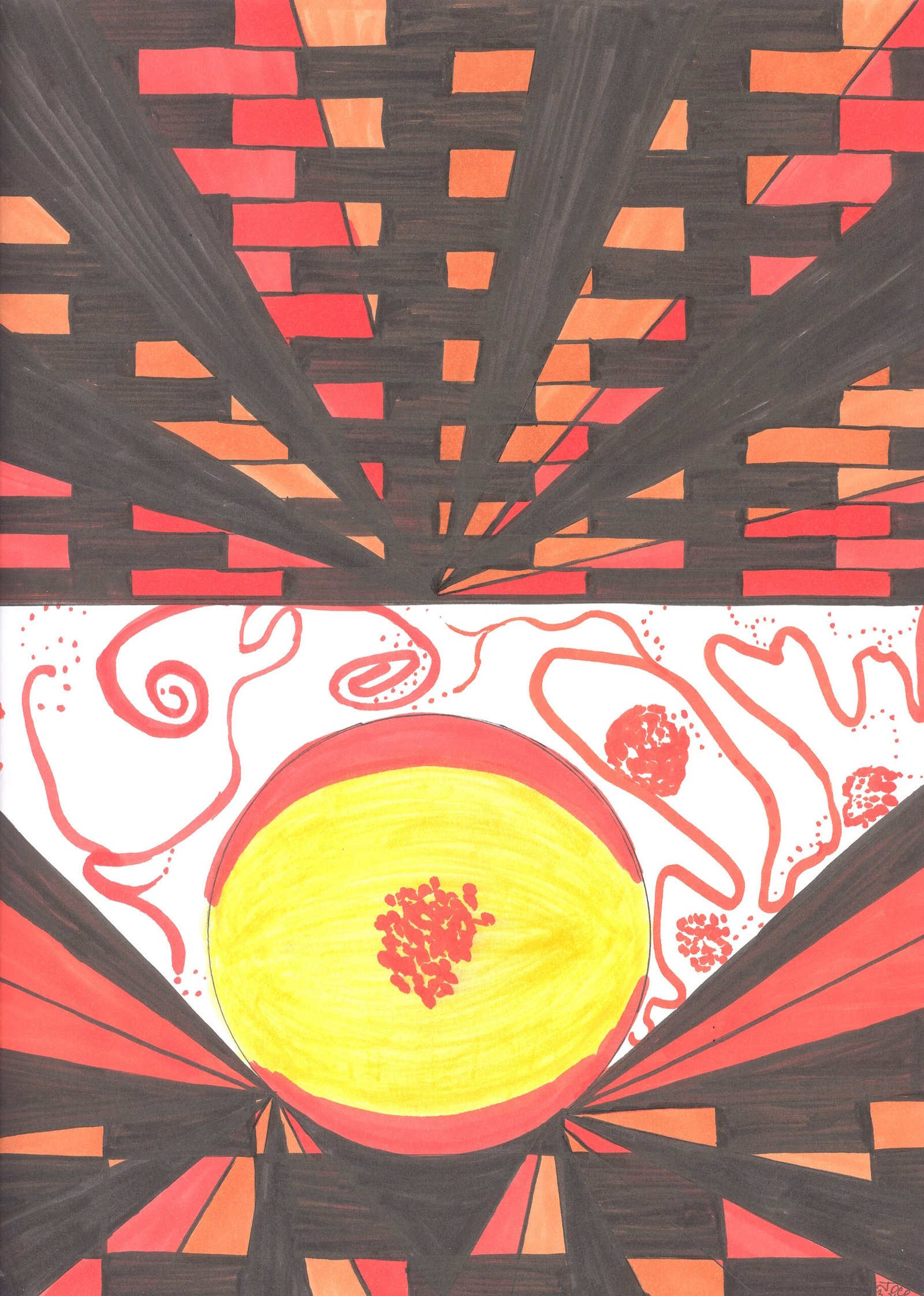
    In “Gulping the Sunset” the glowing yellow sun sits at the center, surrounded by geometric grid lines that feel like a city skyline. The fiery reds, oranges, and black borders give the whole scene a dramatic sunset feel.

    “Solar Flare Structure”

    3/2025

    7” x 10” (copies 8” x 10”)

    Marker Drawing on Paper

    “Solar Flare Structure” has triangular rays spread out and is packed with playful textures like crosshatching, pebbled bubbles, and leafy vines. The warm yellows, fiery oranges, and coral tones make the design feel vibrant.

    “The Hearth and the Soul”

    3/2026

    12” x 9” (framed copies 18” x 12”)

    Marker Drawing on Paper

    In “The Hearth and the Soul” the bold, dark geometric lines and brick patterns at the top and bottom frame the glowing yellow-and-red center. The delicate pink squiggles floating around the core give it a really warm, lively heartbeat.

  • Enjoying Fall

    Enjoying Fall

    An ode to my favorite time of year

    Fall is an inspirational time of year. With the colors of the leaves changing and the weather cooling off, this time of year brings a change of pace that I always look forward to.

    To me, fall has traditionally been a speeding up of life; kids are starting school, teachers are back to school, plans start for the upcoming holidays. This year is no different, however it’s a different kind of speeding up then the one I’m used to.

    I gave my brain a break over the summer to  bask in the inspiration that is life. With that the fall brings me back to my art to allow the inspiration I found to flow out onto paper.

    Stay tuned for new art stemming from this summer’s inspiration over the coming months. I hope you took the time to recharge and find inspiration yourself this summer. 

  • Concept to Completion

    Concept to Completion

    Banned Book Cover Trading Card Exhibit

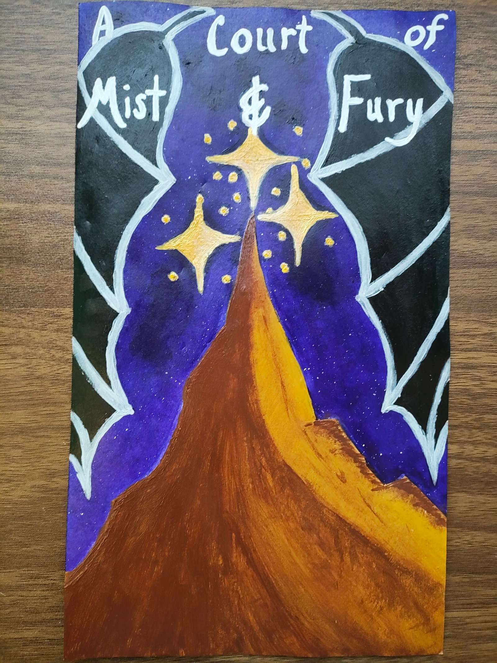
    Recently, I was selected to participate in the Banned Book Exhibit at the Valley Cottage Library. The call to artists was both challenging and meaningful: reimagine a book cover for a title that has faced bans or challenges in libraries across the country.

    I was chosen to recreate the cover for Sarah J. Maas’s A Court of Mist and Fury.

    Behind the Scenes: The Initial Concept

    When I submitted my application for this piece, I envisioned a dramatic, atmospheric piece. My original concept pitch was:

    Concept: A central mountain framed by three stars, set against a deep navy and dark purple background. Warm, vibrant golds, browns, and creams bring the mountain and stars to life, anchored by soft wing details sweeping in at the edges.

    It’s always exciting to see how an idea evolves from quick notes and sketch lines into a finished piece!

    Check out the original concept sketches for both the cover and the bookmarks below!

    Bonus Work: The Bookmark Series

    Working within the exhibit’s specific size requirements meant I had to trim down my larger paper before getting started. Never wanting good paper to go to waste, I ended up with three bookmark-sized strips—the perfect canvas to create three complementary bookmarks!

    • The Bookmarks: Available now on my website at ByJoceW.com.
    • The Book Cover: To view or inquire about the original reimagined book cover piece, please reach out directly to the Valley Cottage Library.

    Thank you so much for being here and following along with my creative process!